Designing trust for high-friction financial moments
Crypto products ask a lot from new users. At RockWallet, I helped the product communicate clearly in high-stakes moments when users were anxious, confused, or blocked from doing what they came to do.
The problem
RockWallet had a growing number of product flows tied to know your customer (KYC), banking partners, fraud prevention, and account security. These moments were important operationally, but from the user's point of view, they could feel abrupt, vague, or even mean.
A user might be told:
- Their account needed more review
- They weren't eligible for a feature
- A bank ACH or card purchase didn't go through
- Their wallet access was temporarily restricted after recovery
In each of these cases, the product needed to do three things at once: explain what was happening, preserve user trust, and stay within legal, compliance, or product constraints. That combination made these flows especially challenging.
The goal
Create UX writing for sensitive financial moments that felt:
- Clear, but not clinical
- Calm, but not aloof
- Transparent, but not overexplanatory
- Human, but still precise
The broader goal was to reduce friction during onboarding and compliance and get new users to the a-ha moment as fast as possible.
The audience
A lot of fintech and crypto apps assume the user is a crypto bro. They're already bought in and know what to do. RockWallet's audience was broader than that. For this work, I wrote primarily for a persona we called Crypto-Curious Becca.
Informational needs
- Is my account okay? Are my funds safe? Is my crypto safe?
- Why is this happening, did I do something wrong?
- What do I need to do next, and how long will this take?
Jobs to be done
- Buy, swap, sell, send, or receive crypto without unexpected roadblocks
- Get reassurance that a delay or restriction isn't permanent
- Understand that compliance steps are required and totally normal
Psychological profile
- Anxiety under uncertainty
- Reactance to accusatory language
- Still deciding to trust the product or not
- Loss aversion when money or crypto is involved
My approach
I treated these flows less like isolated error messages and more like a messaging system for trust.
1. Lead with status, not explanation
When users are stressed, they don't want to parse out a paragraph before understanding what happened. I prioritized copy that quickly answered what's going on, whether the user needs to do anything, and what happens next.
2. Don't accuse the user
In KYC identity verification that eventually determine user eligibility, it's easy for product language to sound judgmental without meaning to. Terms like failed, rejected, flagged, or didn't meet requirements can make users feel blamed, even when the issue is procedural or routine. I worked to make these moments more neutral and respectful.
3. Be honest about limits without sounding evasive
In cases where we couldn't reveal exact reasoning, I focused on what we could say clearly: whether the limitation was temporary or final, whether the user could try again, whether any action was needed, and which features were still available.
4. Write for emotion, not just comprehension
A technically correct message can still be a bad user experience. For KYCs requiring additional scrutiny, restricted access, and account holds, I wrote with the user's emotional state in mind, softening phrasing, removing unnecessary words, and using a grounded tone.
What I worked on
Verification and review states
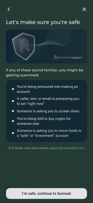
I wrote and refined messaging for identity verification, additional KYC required states, and handoffs to third-party verification and banking partners (Sumsub and Plaid). The challenge: helping users understand why they were being asked for sensitive information without making the process feel more intimidating than it already was.
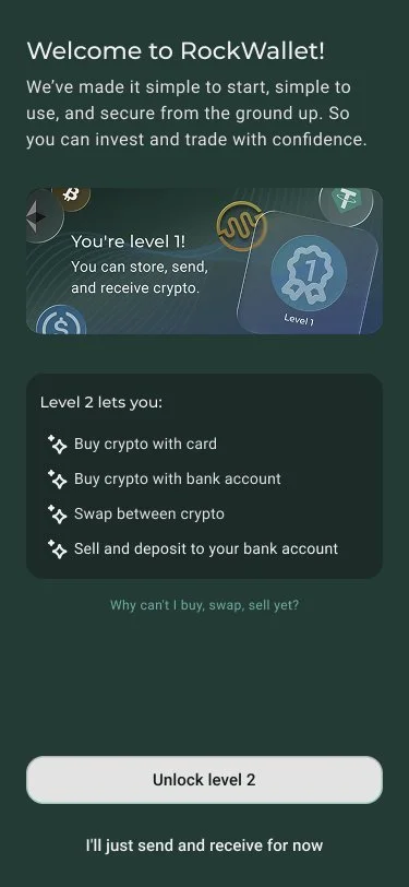
Eligibility and feature restrictions
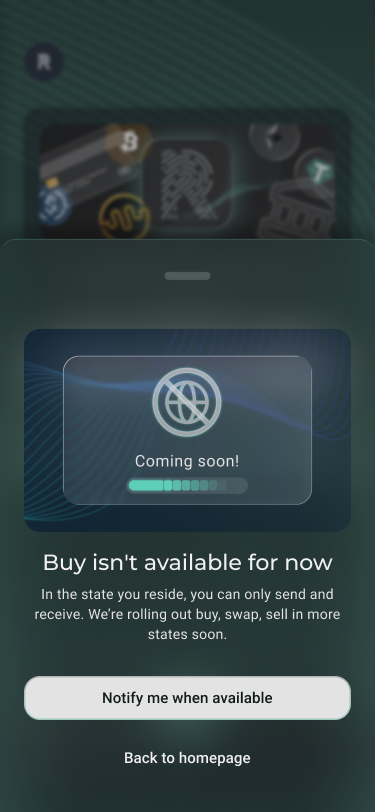
I worked on messages shown when users weren't eligible for certain features or trade actions. Some flows allowed copy specific to the user's verification level and geolocation. Others required intentionally generic versions. These required careful wording so users understood the outcome without feeling singled out or permanently shut out.
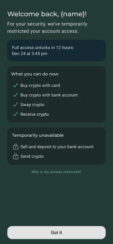
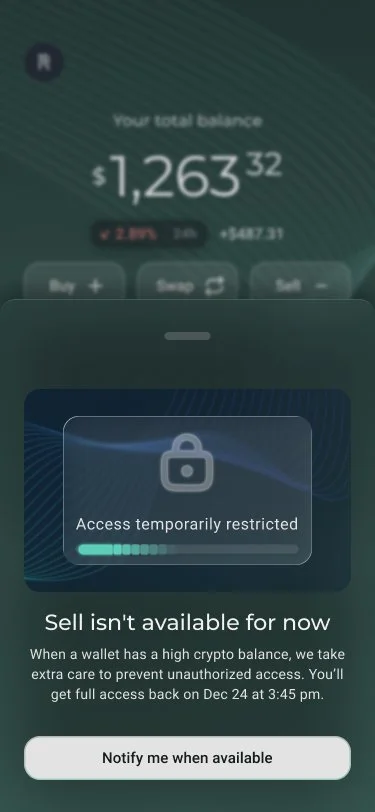
Wallet recovery and temporary account holds
One of the more sensitive flows involved successful wallet recovery followed by temporary restrictions on high-balance accounts. The writing had to strike a precise balance: reassure users that recovery worked, explain the temporary limitation, and frame the hold as a protective measure, not a punishment.
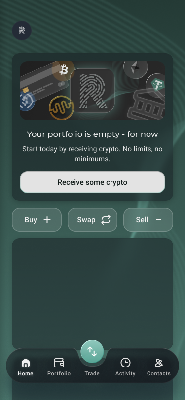
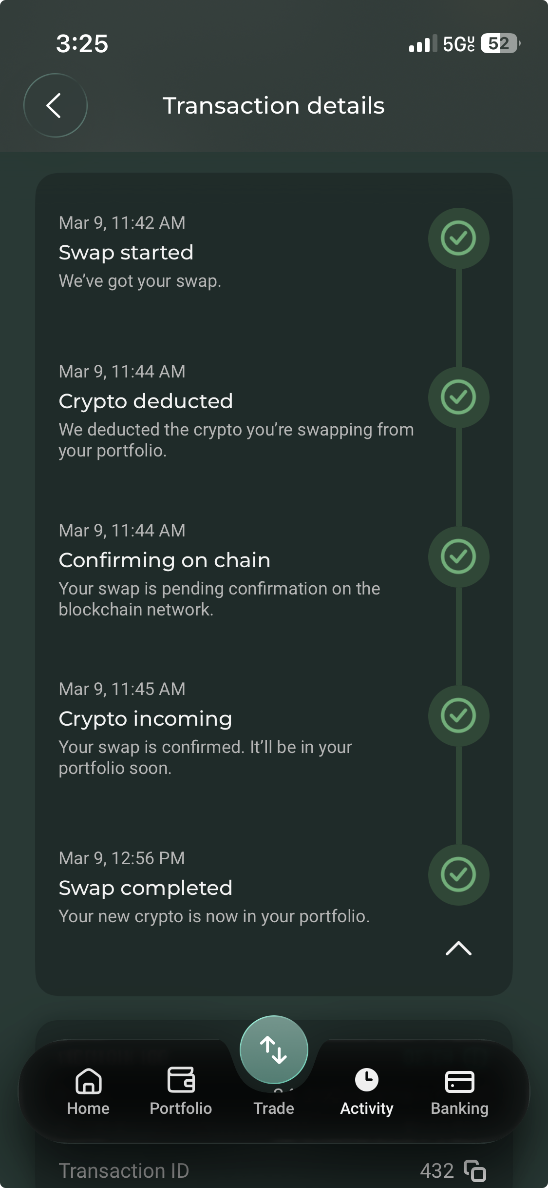
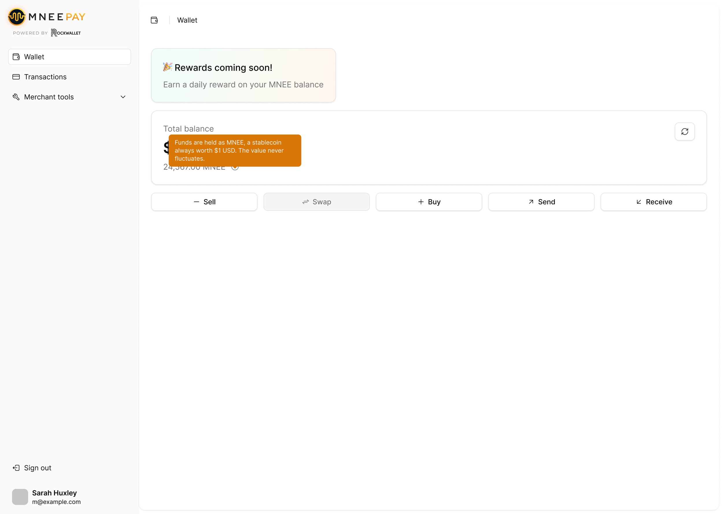
Transaction statuses
I worked on operational states for successful transactions, pending transactions, and payment processing delays. These moments needed especially clear status language, since users were often worried about where their money and crypto was and whether anything had gone wrong. I also saw this as an opportunity to educate Crypto Curious Becca on what's actually happening behind the scenes when they trade crypto.
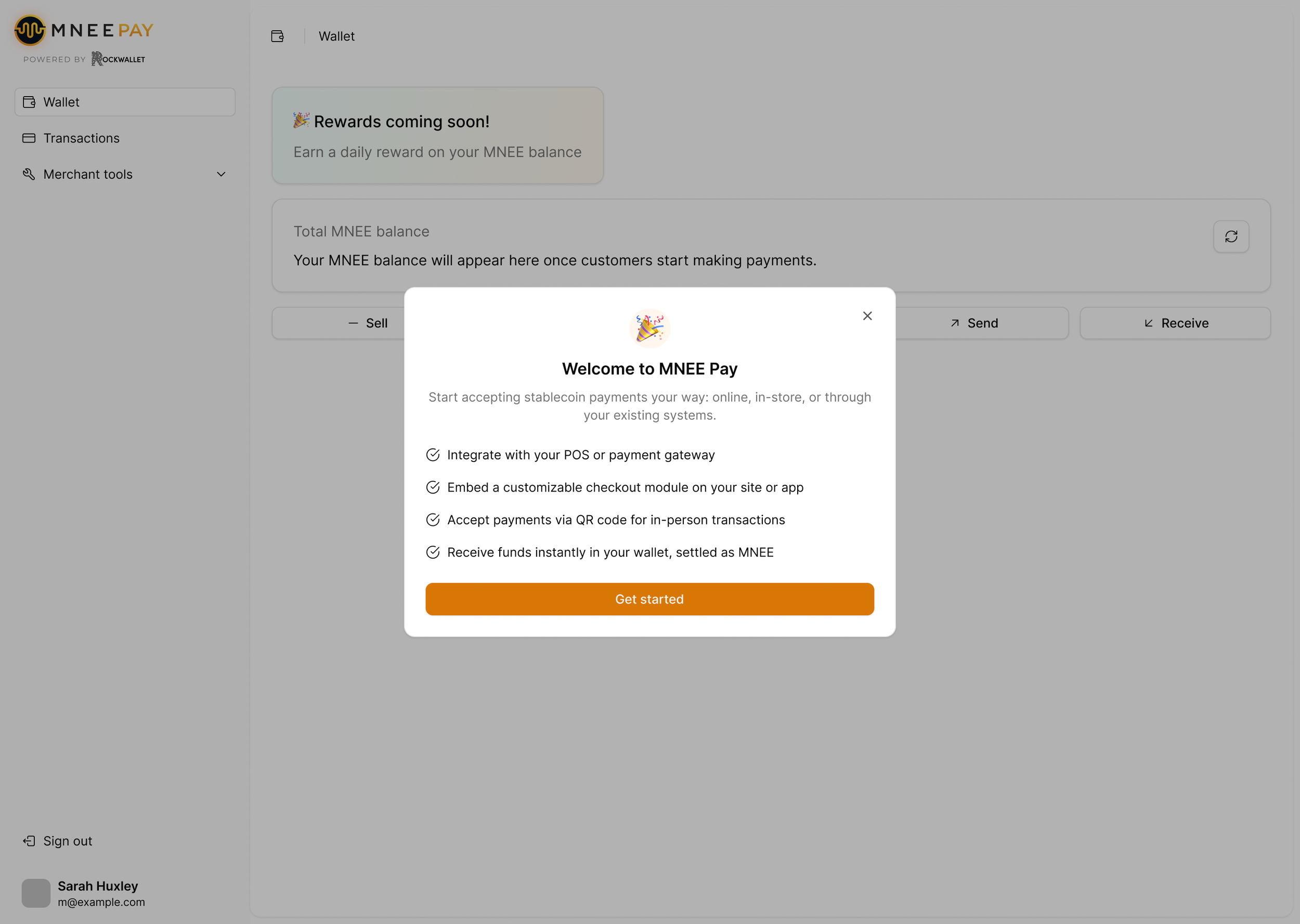
Tooltips and support copy for technical features
In addition to high-friction system messages, I wrote educational product copy for more technical areas like payment integrations and merchant tooling, extending a consistent voice into more operational parts of the product.
Iteration and collaboration
Stakeholders across product, compliance, and support all wanted specific things mentioned in the copy. Including it all would've been a mess. I argued that users just needed it to feel simple. Many refinements came down to questions like: Is this too vague? Is this too specific? Does this sound final when it might not be? Does this accidentally imply blame? Are we creating more fear than necessary? Is the next step actually clear?
Outcome
This work helped create a more consistent voice for some of RockWallet's hardest product moments. Instead of treating restrictions, delays, and review states as one-off messages, I helped shape a clearer and more human approach to communicating them, better balancing user trust with the realities of security, compliance, and financial operations.
The moments that build trust are not the flashy "success" messages. Rather, they're the moments when something goes wrong, takes longer than expected, or can't happen yet and the product still manages to sound calm, clear, and respectful. That's where good UX writing really shines.